Project Overview
For this magazine spread project, I selected a fashion article on the late iconic designer Lee Alexander McQueen. The chosen article, "Fashion, the Body, and the Tortured Genius of Alexander McQueen," by Erin Evans for The Michigan Daily, served as the foundation. By combining the text with a selection of images that I've carefully curated and self-drawn graphic elements, I created a fashion-themed magazine spread that evokes a sense of melancholy, paying homage to one of the greatest designers who ever lived.
Programs Used
Adobe InDesign, Illustrator, Photoshop
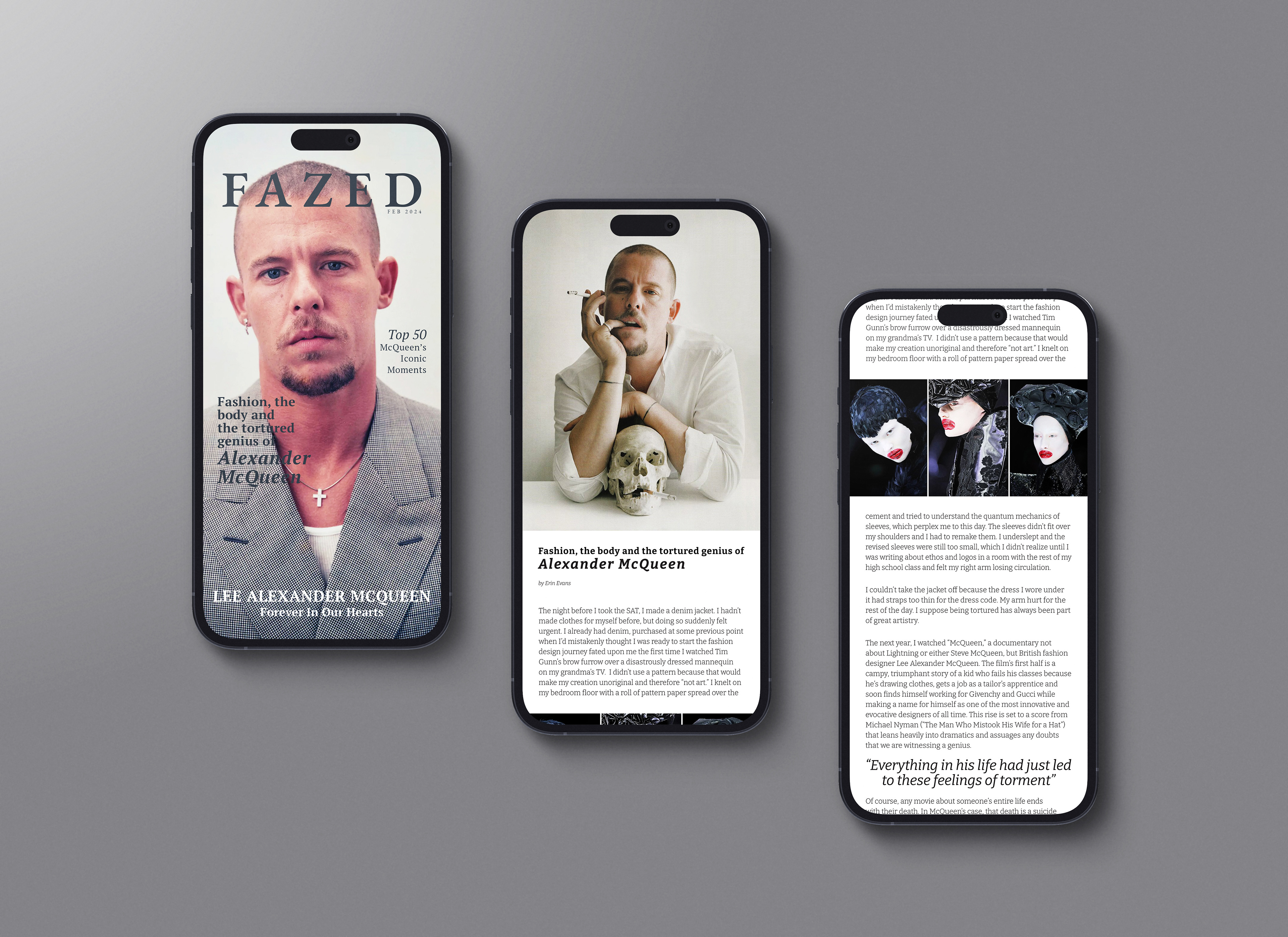
Mobile mockup
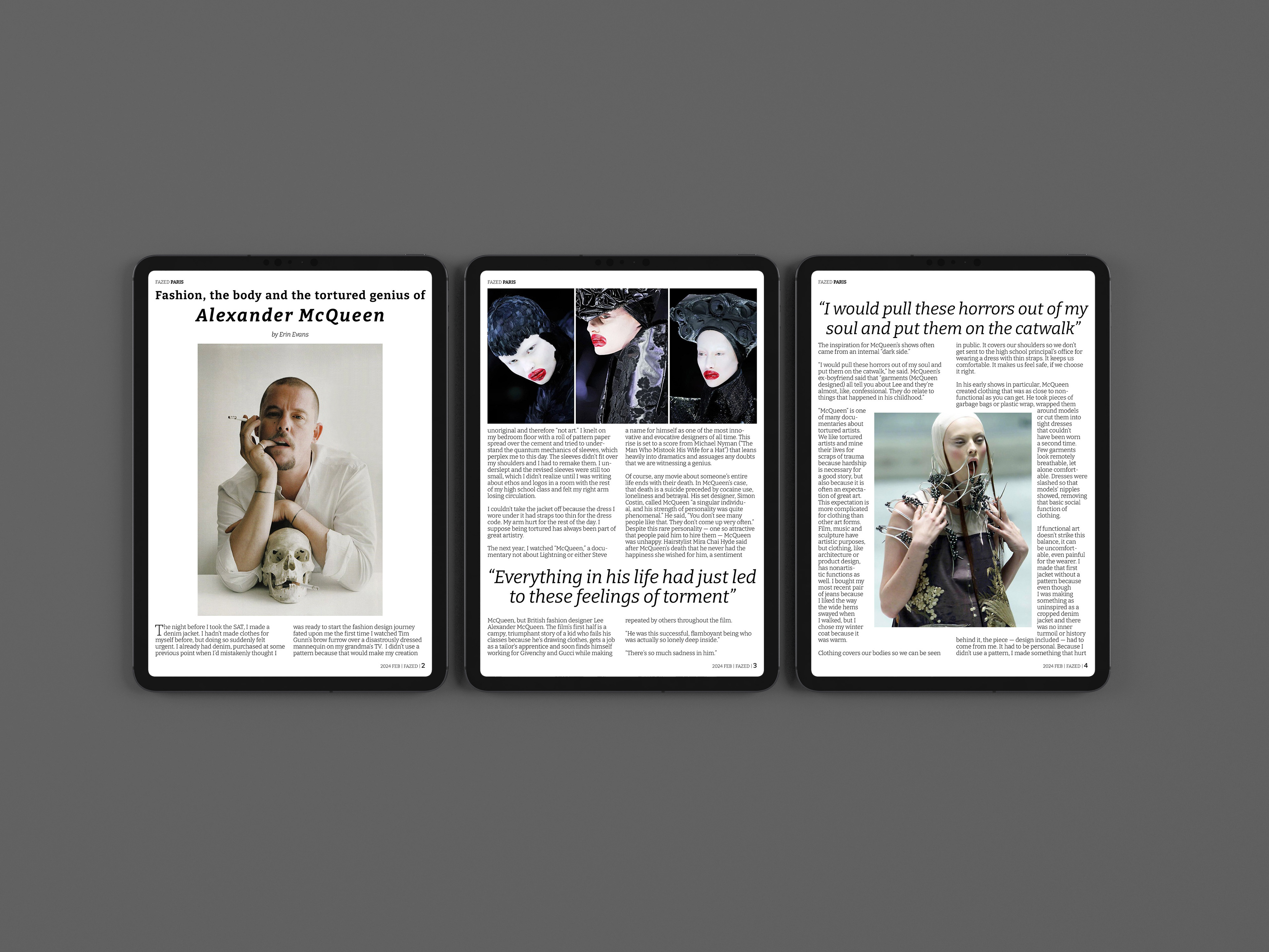
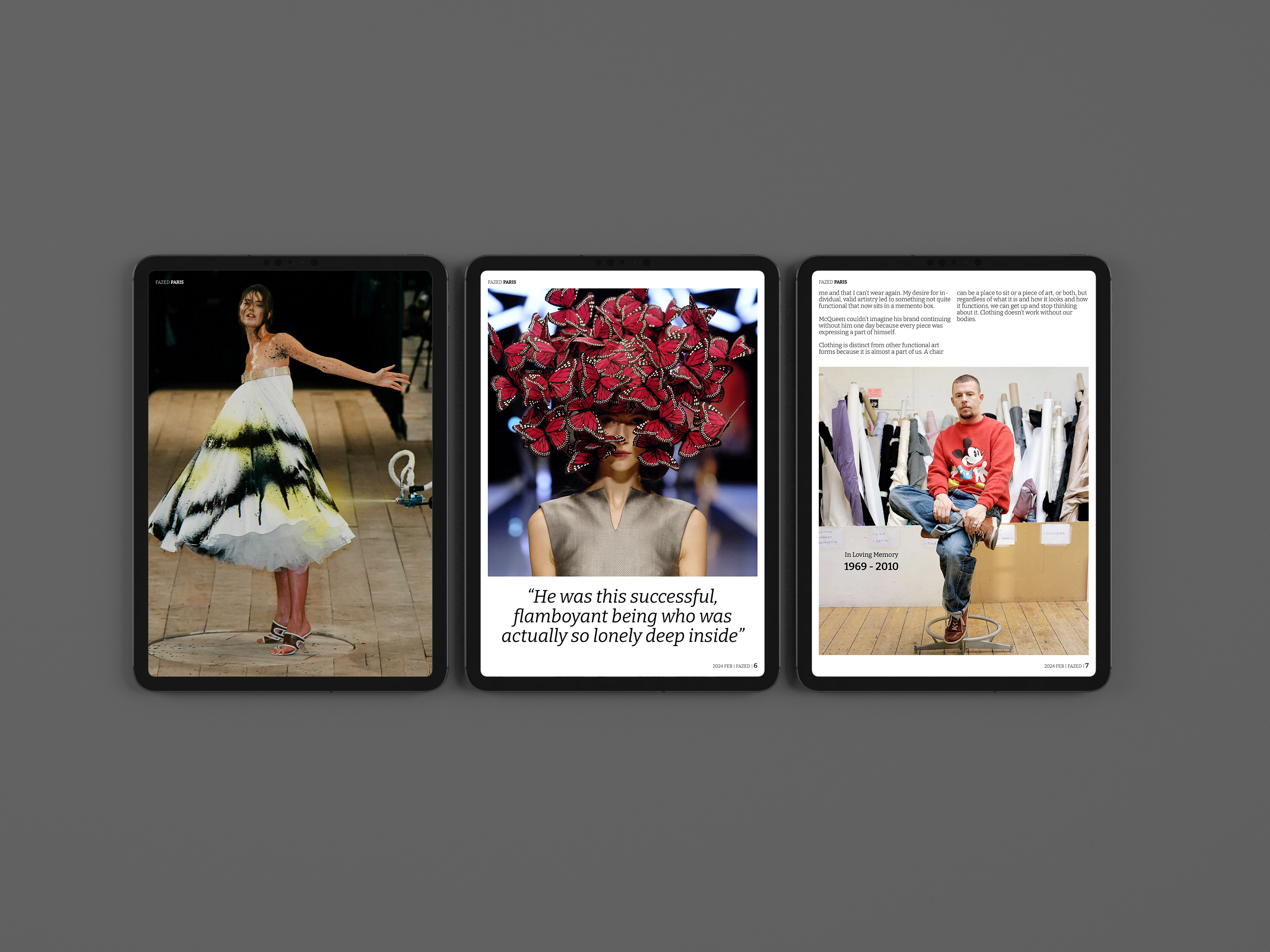
Tablet mockup
Application Usage
InDesign, Illustrator, Photoshop
Content Selection
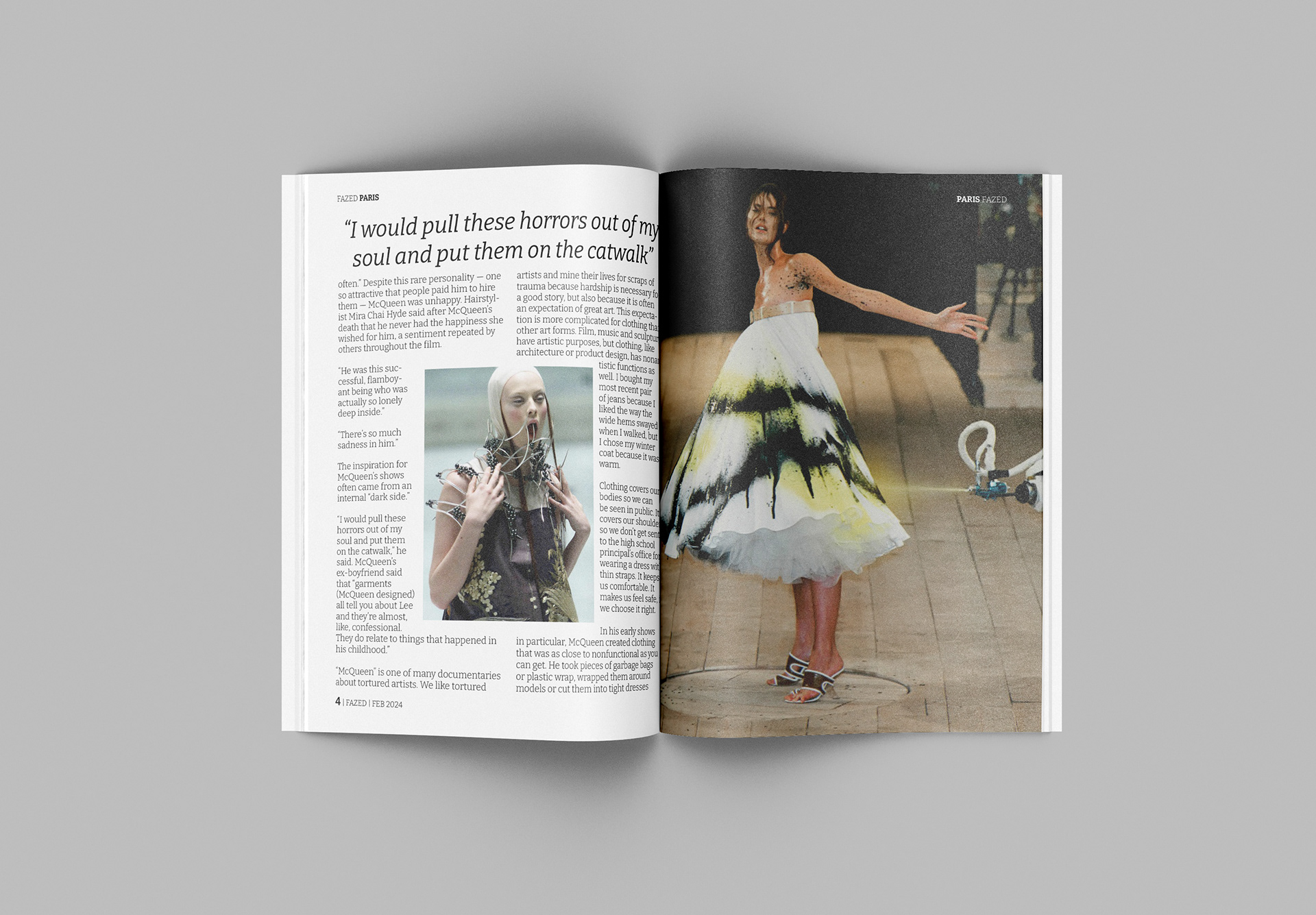
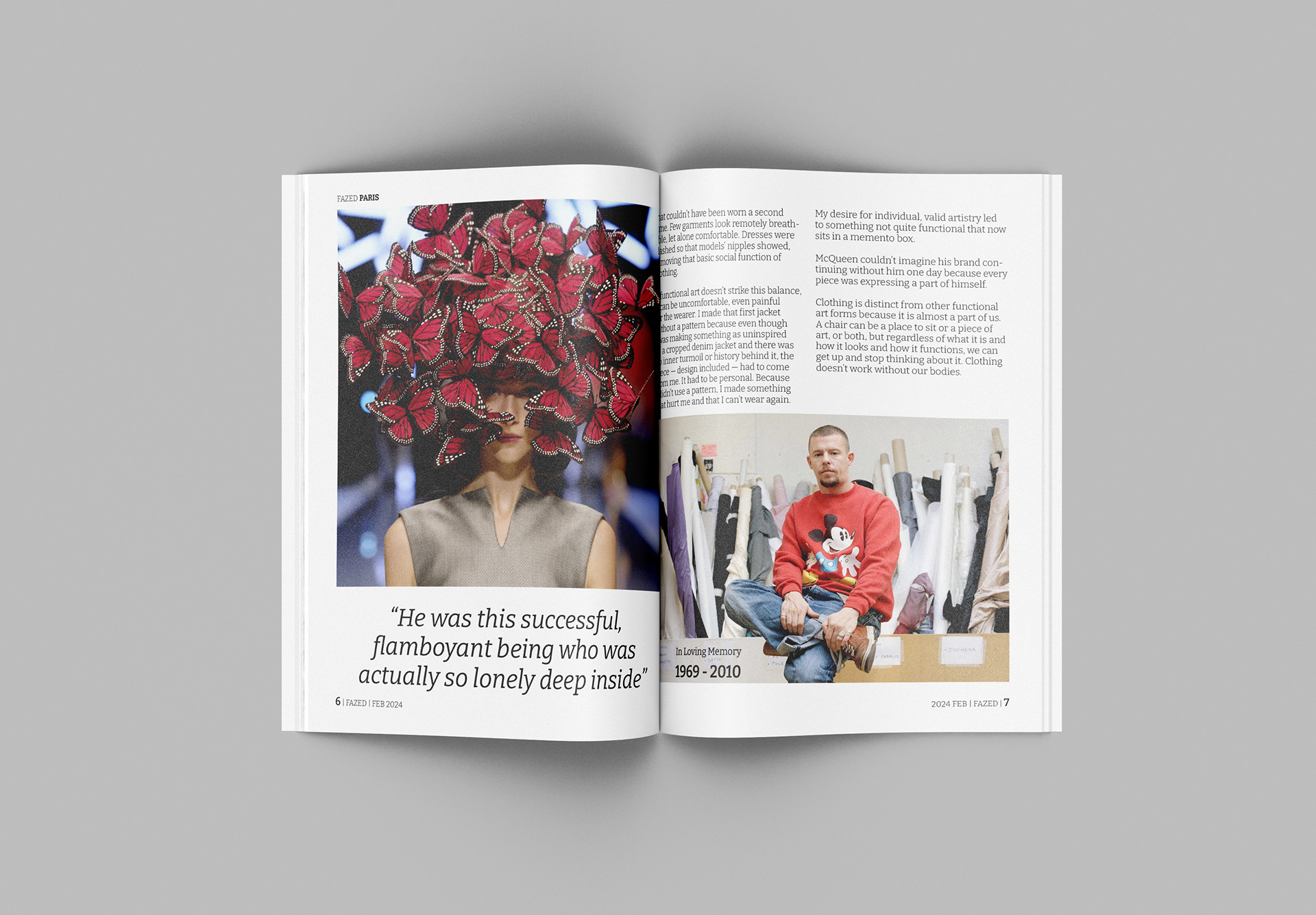
Given the somber tone of the article, which delves into the inner demons of the late designer, I incorporated runway pictures from McQueen’s shows that reflect this sadness. To emphasize the fashion theme, I used numerous images to showcase McQueen's genius designs, allowing readers to fully immerse themselves in the McQueen experience.
Print Design (flats)
Layout & Formatting in Indesign & Illustrator
Modular grids were employed in both the print and tablet versions to ensure consistent spacing and alignment of all elements. Additionally, a baseline grid was used to maintain uniform alignment for the main body text, excluding pull quotes.
To balance the use of media, I used negative space to give reader's time to digest between each sections. For example, in the print version in InDesign, I ensured that a minimum of 0.2 inches - 0.3 inches of break between texts and images were employed. Line spacing was set to +2 points from the font size of 12 pts. Tablet version was set +3 pts from the font size of 30 pts. In the mobile version, which was created in Illustrator, font size 39 pts was used with line spacing of 49 pts.
In addition, in the mobile version, I ensured that there were enough empty spaces between each picture and the texts above and below it; thus, a minimum of 80 pixels of height was implemented before and after each picture.
Fonts
The following serif fonts were chosen to maintain the somber tone and essence of paying homage to McQueen:
EB Garamond for the magazine name "FAZED"
PT Serif for article titles on the front cover
Bitter for headers and body text within the article
TABLET DESIGN (flats)
Challenges in the Process
One significant challenge was adjusting images to fit the varying dimensions across different platforms while ensuring the main areas of each image remained visible. This was particularly challenging for the mobile version’s cover page, where substantial content compromise was necessary. (Also speak to column and width adaptations going from one platform to the next, how did you adapt and decide what went first etc.)
Another challenge was managing font size changes between platforms, which sometimes required layout adjustments. To resolve this, I altered image dimensions to ensure a consistent and identical reader experience across all platforms.
MOBILE DESIGN (flats)
Mockups

Reflection
I thoroughly enjoyed working on this project because it highlighted the significant adjustments required when transitioning a design from print to digital. The differences in font sizes, line spacing, page dimensions, and line layout all necessitated careful consideration. For instance, the print version used a font size of 12 points with a leading of 14 points, but when adapted for a tablet layout, the font size increased to 30 points with a line height of 33 points. Despite these changes, it was essential to maintain a consistent goal: ensuring that the user has a seamless and consistent experience reading the article, regardless of whether they are viewing it in print, on a tablet, or on a mobile phone.
